Creating a winning design often hinges on the right color combinations. Colors evoke emotions, set the tone, and guide the viewer’s attention. Whether you’re designing a website, a poster, or a living space, selecting harmonious colors is crucial. Let’s dive into the art and science of choosing color combinations that resonate with your audience and enhance your design.
Understanding Color Theory
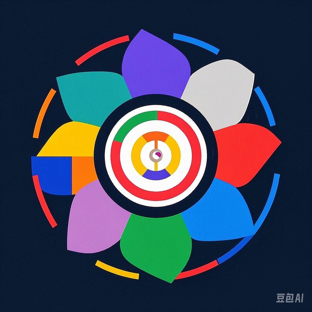
Before we delve into combinations, it’s essential to grasp the basics of color theory. The color wheel is a fundamental tool that helps us understand color relationships. It’s divided into primary, secondary, and tertiary colors, with a variety of hues in between.
Primary Colors
- Red
- Blue
- Yellow
Secondary Colors
- Orange (Red + Yellow)
- Green (Blue + Yellow)
- Purple (Red + Blue)
Tertiary Colors
- Red-Orange (Red + Yellow-Orange)
- Yellow-Green (Yellow + Green)
- Blue-Green (Blue + Green)
- Blue-Purple (Blue + Red-Purple)
- Red-Purple (Red + Blue-Purple)
Color Harmony Rules
Complementary Colors
Complementary colors are opposite each other on the color wheel. They create a striking contrast and can make each other pop. For example, blue and orange or red and green are complementary pairs.
Example: A website for a sports brand might use a vibrant red and a complementary green to create a dynamic and energetic look.
Analogous Colors
Analogous colors are next to each other on the color wheel. They work well together because they share a common color trait. For instance, a blue, blue-green, and green palette can create a serene and cohesive feel.
Example: A spa’s logo might use a blue, blue-green, and green color scheme to convey relaxation and tranquility.
Split-Complementary Colors
Split-complementary colors involve choosing a color, then selecting the two colors adjacent to its complementary color. This creates a more balanced and harmonious look.
Example: A fashion brand might use a purple base color with orange and yellow to create a stylish and modern aesthetic.
Triadic Colors
Triadic colors are evenly spaced around the color wheel. This combination offers a vibrant and energetic look but can be challenging to balance.
Example: A tech company’s branding might use blue, red, and yellow to convey innovation and dynamism.
Tetradic Colors
Tetradic colors involve two sets of complementary colors. This can be overwhelming and is best used sparingly.
Example: A graphic designer might use red, green, blue, and orange to create a bold and attention-grabbing design.
Consider the Context
When choosing colors, it’s important to consider the context in which they’ll be used. Think about the message you want to convey and the emotions you want to evoke. Here are a few factors to consider:
Target Audience
Understanding your audience is key. Different demographics may prefer different color schemes. For example, young adults might appreciate bold, vibrant colors, while a more mature audience might prefer muted, sophisticated tones.
Purpose of the Design
The purpose of your design will influence your color choices. A fun, playful design might benefit from bright colors, while a serious, professional design requires more subdued hues.
Cultural Significance
Colors can carry cultural meanings. For instance, white is often associated with purity and innocence in Western cultures, while in some Eastern cultures, it’s associated with mourning.
Tools for Color Selection
Color Wheels
Color wheels are a great starting point for finding harmonious combinations. They help you visualize relationships between colors and can inspire new ideas.
Color Palette Tools
Online tools like Adobe Color, Coolors, and Paletton can generate color palettes based on your chosen colors, ensuring a cohesive and balanced design.
Eye Droppers
Eye dropper tools in design software allow you to sample colors from images, making it easier to create a color scheme that complements your source material.
Conclusion
Choosing harmonious color combinations is an essential skill for any designer. By understanding color theory, applying harmony rules, considering your context, and utilizing the right tools, you can create visually appealing and emotionally resonant designs. Remember, the perfect color combination is one that complements your message and speaks to your audience. Happy designing!